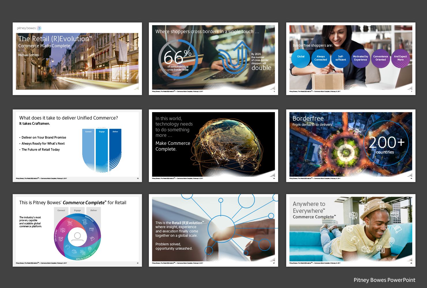
Develop your brand narrative in PowerPoint? Never. Until it really works.

John Nishimoto
Steve Jobs hated it. Marketers and business executives want to leave it behind. Savvy salespeople might cherry-pick a page or two but abandon the deck. And designers run for the hills. The haters of PowerPoint see it as a presentation crutch or, at the very least, the reason why your meetings always run over, otherwise known as “death by PPT.”
But in today’s world of briefer-is-better, PowerPoint can force you to cut to the chase and deliver optimal impact, frame by frame. If it’s set up with the right construct with great content, both visual and verbal, and most importantly, with the right story to tell.
Content and its discontents
We’ve all had the PPT experience of undifferentiated hordes of text descending upon us in incessant bursts, an endless fusillade of bullets vying to hit the mark. While clunky graphics or scattershot snapshots or strings of colored text boxes connected by arrow after arrow — or all of that, all at once — come crowding in. And the idea that something useful and worthwhile is being communicated just gets lost.
So how’d it get this way?
Perhaps they put the wrong people at the controls. The great thing about PPT: anyone can use it. The horrible thing about it: everyone does. As a DIY device, it’s a mess: there are a whole lot of things you can do, with nothing keeping anybody from doing every last one of them on each slide.
From the beginning, this inherently powerful storyboarding and presentation device — built on slides — became a de facto document creation tool for the grinding out of 30, 60 or even 100+ pages of wall-to-wall tiny type and competing assortments of geometric shapes also chock-full of type. And when you have smart people who know way too much about a given marketing or sales topic and want to share it all … it easily can become an unbearable meeting to sit through.
The thing is, how PowerPoint has been used and abused just isn’t how it has to be.”
In fact, we’ve seen it used in ways that not only help to capture the essence of why your product, your company, your offer is the right one to consider, but also in ways that help bridge the gaps between business priorities, marketing vision and sales activation.

Back to the (story) board
As human beings, we inherently are storytellers. And what better way, in today’s over-messaged world so desperate for clarity, to tell your story than through a storyboard? Here’s a great way to sequence your message, succinctly, slide by slide, beginning middle and end, with the visual and verbal melding together seamlessly.
Think of it as more than a visual outline, instead the cinematic storyboard for how your story should be told. As true experts on the topic of storytelling, one of Pixar’s main tenets is: know where your story is going and make it relatable and credible to your audience. In a similar vein, the mapping out of your overall narrative has to check the high-level boxes of Why should I care? What’s in it for me? and How easy is it to engage with what you’re selling?
PowerPoint is just a tool. And in the right hands, it can be art — the art of persuasion.”
So let’s not think of it so much as a repository for how much we know, but rather a sequencing tool for how your value proposition and brand narrative can be constructed, with the end goal of communicating “show me that you know me.”
Visual shorthand
We all know that storytelling is not simply verbal, providing just word cues, data points and insights. Most folks need a visual to truly grasp the full story, so we always look for ways to sketch out a simple idea of how you deliver value for your customers — what we call a “solutions graphic.” Whether it’s for a product launch or an enterprise-wide solution sell, this is the ultimate glyph, totem or infographic that tells the story of “Why you?” It’s a way of capturing your promise and how you fulfill it, distilling your entire business offering into a single, shorthand graphic — simple but meaningful and memorable. It has to be easy to draw, on a whiteboard or a napkin, and easy to speak to.
Whether you’re a technology start-up, a financial services stalwart or global solutions company, you can benefit from having a visual shorthand that demonstrates your business value and how you deliver it.
Quick example: In working with a fin-tech company called Envestnet, we developed a simple compass-like graphic called the “Advisor Suite,” designed to illustrate how their offering connected specifically to their customers, in this case registered investment advisors. This simple visual organized their diverse set of over 25 products and services into four customer imperatives. It makes what they do easy to understand: there are four major parts of their business, four customer-focused imperatives they catalyze, while giving sales a platform to talk to the full scope of solutions they offer for a specific customer call. It has even helped the company’s senior management and board of directors focus in on what areas of investment or innovation they should consider and what companies to acquire to fill out their portfolio of solutions. It’s not just a unifying graphic, it’s a strategic tool and a business asset.
Visual shorthand is what PowerPoint should be all about.
The power of PowerPoint
PowerPoint is great for storytelling, for staging and sequencing — in a compelling visual and verbal narrative — the unique character of your brand and your solutions, and why it and they and you matter. It’s a great way to iterate, to test how to present yourself and adjust accordingly.
PowerPoint is just a canvas, blank cells for a memorable, brief slideshow that animates your business and sales imperatives.
In closing, this tool is not going away. PowerPoint is ubiquitous in the business world. It’s how businesspeople communicate.
But few know how to leverage it effectively — not as a data-dump leave-behind, but as an engaging and cinematic way to align your brand and sales narrative. Done right, you can turn a meeting-drainer into a show-stopper that bridges the gap between what your brand narrative is and the stories your sales force are telling out in the real world.
5 common mistakes with PowerPoint
- Don’t say everything you have to say. It’s not a treatise, it’s a moment of clarity.
- Focus! Start with the key takeaway or call to action in mind, and work backwards from there. Repeat it, reinforce it. And then close with it.
- If content is king, design is queen. Sketching out how your ideas and content can be visualized is as important as the ideas themselves.
- It’s not a graphics program. You can make graphics with it, but there’s a reason people say, “PowerPoint graphics.” Use professional graphics and motion tools as well as the right professionals who can get you the quality you need.
- Too many sales decks speak to the granular details and product features. Think bigger first. What are the trends that are changing the market, what do they mean for your customer’s business and how does what you do fit into their business challenges ahead? And, lastly, why you? Why should your customer consider your story, your offer versus someone else’s?
The right Q’s:
- How does your marketing and sales team share and compare the vision of your brand with the realities of what the frontline feedback is?
- When’s the last time you did a pulse check on how your brand toolkit (visual and verbal) was being used and abused by your sales teams?
- If you asked five folks from sales, “Give me your version of the elevator pitch?” what would they say? Do they go right to product speeds and feeds? What are the similarities and differences between how they present the part about why choose you? Is it helping or hurting your brand and marketing imperatives?
Related News & Insights
-
 Insight
Brand loyalty: Where do you stand?
Thriving in the new economy demands building and preserving brand loyalty. But how, really, does your brand measure up — with customers, investors, employees and others? Understanding where you stand now is essential to knowing what to do next, and to evaluating your progress as you build your enterprise and increase the […]
-
 Insight
For those who call it just “look-and-feel” — think again. Think VIBE.
Merriam and Webster agree that the word “vibe” means a feeling or spirit that someone or something gives you. The Urban Dictionary echoes that, adding, “a distinctive emotional atmosphere.” So when a project manager at a large global brand consultancy handed out a project status sheet with lots of narrow columns and […]
-
 Insight
Smart CMO: Excel, beat the odds and become a C-suite star.
As a CMO, you may often feel there’s a target on your back. You’re under constant pressure to achieve results, especially in a challenging economy — yet those results can be hard to quantify with the precision other executives are able to summon. It’s no wonder that the average CMO’s tenure lasts […]


